Observations on Photography for Artists
WELCOME TO THE FIRST INSTALLMENT of an ongoing series from guest writer-contributor and member Jamia Weir, in which she explores events, opportunities, and brewing ideas of interest to artists and creatives.
First up: a review of our very own Photography for Artists Pro Development workshop!
As part of the Textile Arts LA “Professional and Organizational Development (POD) Program,” on Wednesday April 24th, 2019, a session called Photography For Artists was presented by New York-turned-Los Angeles based photographer Cecily Brown. A small group of about 15 creative people at the Helms Design Center in Culver City sat among the current “Good Natured” art exhibition there, a title seemingly mirroring the good vibes and casual atmosphere Textile Arts LA and a bunch of artists sitting together tends to create.
Cecily began her presentation by sharing some of her own work, including a beautiful series of black and white photographs of her grandmother, entitled “Don’t Call Me Mary” as well as pictures from an ongoing series of artists-at-work portraits of makers in their studio spaces. Afterwards, she asked the group what their issues are with photographing their own artwork, to which people responded with things like “shooting under glass” or “glossy surfaces,” “getting colors right,” and “capturing 3-dimensionality.”
Cecily encouraged us all to strive for properly photographing our work, these “reflections of yourself” deserve respect, with all the time and energy that was put into creating, and by using basic lighting and editing techniques, you can give the work the respect that it deserves. Most of us have this “all-in-one machine” as Cecily called it, that does these very things we need as artists, photographing, editing and then sharing, right in our back pockets or bags…the iPhone. The fact that we could use our phone cameras made this particular workshop very valuable and relatable, and instant. We got right to work at the end of the presentation, photographing small works that we were asked to bring.
Before getting to work, we learned an overview of preparing artwork to be photographed, where to hang it, lighting it with artificial lighting, using tripods and other tools, dealing with shadows and angles as well as editing basics with apps we could use on the iPhone, such as VSCO, A Color Story, Adobe Lightroom or Snapseed. One interesting and helpful tip that was shared was that after assessing your available light, natural vs. artificial, you should choose just one of these only. For example, if you are photographing near an open window, utilizing the light that is streaming in, then you should turn off the artificial light that is overhead in the room, so that you have one consistent light source.
We were taught how to turn on the “grid” on the iPhone camera so that we could better utilize the “rule of thirds” and center our work in the frame. Cecily told us that when photographing artwork, you really want to position your body in the center of the piece and get on the same level with it. If there are shadows, you can use your judgment on how soft or hard to make them, or how visible in general…are they almost meant to be a part of the art piece? Where do you want them placed? You can shift around your light source in order to shift the shadow placement and shape.
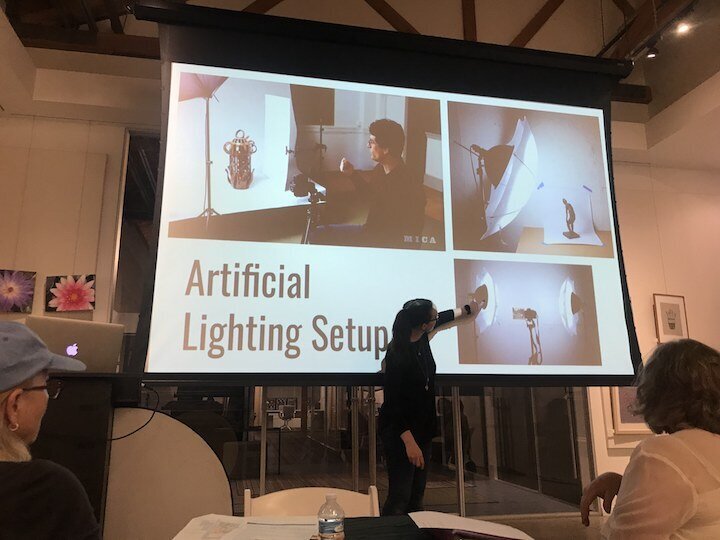
Cecily gave many photographic examples in her presentation on the different concepts she spoke of, which was very helpful. She then went on to show us a professional light setup that she had prepared for the session, after we turned off the Helms Design Center overhead lights, in keeping with how she taught us to just use one type of lighting. The setup consisted of those nifty photographer umbrellas that sat up on tripods behind fluorescent bulbs. The tripods were pointed at 45 degree angles toward a table with a white piece of photography background paper, where we could position our artwork. Since we were asked ahead of time to bring a piece of artwork that we wanted to photograph, I chose a recent sculptural piece that I made with recycled items, because I don’t know how to photograph it to make it look as good as it looks in person. With this lighting setup and Cecily’s help, I was able to get a few quality photographs I was pleased with, as were many others.
At the end of the night, you could feel an electric buzz of confident and hopeful artists, equipped with new skills that they were excited to go and implement.
Photo I edited and posted on my social media Instagram “story” @artgirlsy Cecily spoke about always giving editing a try!
Cardboard flowers in jar. Perrier cardboard box, Happy Egg carton, Second Chance beer can, plastic fork and red twist tie. Jamia Weir, 2019.
(Photographed by Cecily Brown)


